Paint, Patterns and Places: Ossip Klarwein & Alvin Mavignier


Almir Mavignier, convex, concave, convex, 1971 | photos Carlos Struwe 1975


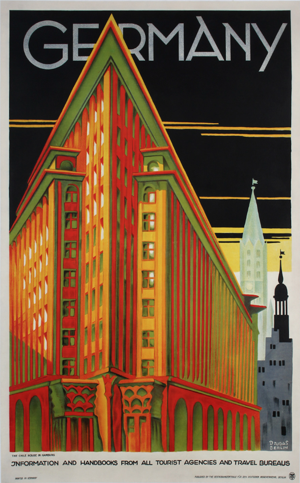
I’m sure you will know the Chilehaus – that ship‑like giant, built of brick, jutting out in Hamburg’s Kontorhaus district. It’s a landmark of Northern German Brick Expressionism, designed by Fritz Höger and completed in the early 1920s [see an image down below]. But little is known that this iconic landmark set the stage for another brilliant mind: Ossip Klarwein (1893–1970).

In 1927, Höger hired Klarwein as chief architect. Until 1933—a pivotal year in German history—Klarwein helped shape the look and ambition of Höger’s office. His influence reached beyond Hamburg, most famously with a Berlin church at Hohenzollernplatz, whose bold silhouette earned it the nickname “God’s power station.”

1935. Photo by Carl Dransfeld † 1941-11-09, Public domain, via Wikimedia Commons
Ossip Klarwein, Kirche Hohenzollernplatz, Berlin 1930-33 | photo by Carl Dransfeld, 1935 | public domain, via Wikimedia Commons

Ossip Klarwein was closely connected to Hamburg and the building styles of the North Sea region. When the Nazis took over in 1933, he was forced to leave for Haifa, Palestine. He first scrambled to gain a foothold, but by 1945, he was appointed to design key public buildings, thereby coining a Modernist style that would shape many later structures.

Many, only very recently excavated visual and written documents have been assembled to an exhibition of international collaboration: a collage of Klarwein’s life and work. Complemented by large-format pictures by the Israeli photographer Eli Singalovski (*1984). After its premiere in Berlin in October 2025, it is now showing at the Ernst Barlach Haus, as one of over forty contributions to The Jewish Cultural Heritage Days, 2025.

This, however, is only half of the “story” –

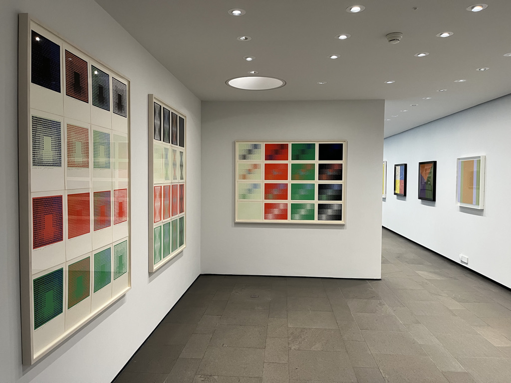
The Barlach Haus with its white, rather modest façade, does not immediately suggest that it can comfortably host two exhibitions at once – and yet it does. In the other half of the museum it feels like stepping into a very different universe: one of vibrating colour fields, serial structures and optical surprises. Here the atmosphere shifts towards Op Art – a movement many have heard of, but fewer could confidently explain, which is exactly what we will be exploring during the second half of our visit.

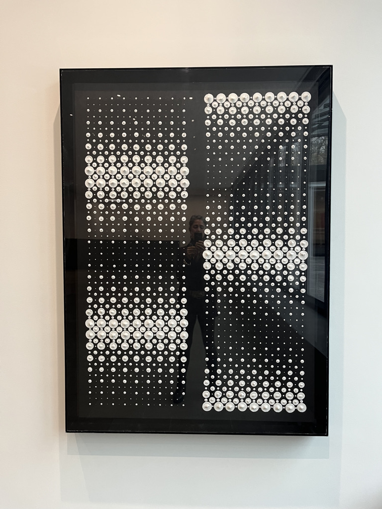
At the heart of this second “chapter” is Brazilian‑born artist Almir Mavignier (1925–2018), who had a deep and lasting connection to Hamburg. Mavignier is recognised as an important representative of Concrete Art and Op Art, who taught for 25 years as a professor at the HfbK, influencing generations of students. His artistic path began early in Brazil, where he worked simultaneously as painter, graphic artist and teacher.

An especially formative period was his work leading an art studio in a psychiatric clinic, where he experienced first‑hand how powerful simple forms and colours can be. Mavignier’s international breakthrough came after he moved to Paris and later to Ulm, where close contact with artists and thinkers such as Max Bill and Josef Albers sharpened his interest in systematic colour experiments and serial structures.

Instead of telling stories with figures or landscapes, Op and Concrete Art work with perception itself: grids, dots, lines and pure color are arranged so precisely that your eyes begin to do the “moving” for you. Standing in front of these works, you may notice patterns that seem to shimmer, tilt or pulse, even though the canvas is perfectly still. The longer you look, the more your own vision becomes part of the artwork.

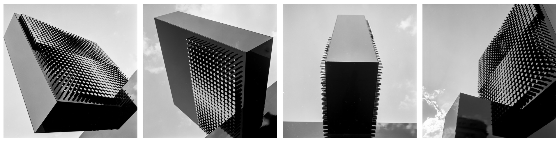
If you are in Hamburg, Germany then you may have even unknowingly walked past one of his few large outdoor sculptures titled convex concave and convex that was installed in 1971 at the Kirchenallee, Hamburg Hauptbahnhof. The complicated process of assembling the over six metres tall, black and white sculpture is documented on the official Mavignier website, run by his artist-son, Delmar Mavignier. It includes a full-length interview with the Almir Mavignier and shows many detailed, contemporary photographs by Carlos Struwe.

In the context of the Klarwein exhibition, Mavignier’s works add a rich counterpoint: while Klarwein builds with concrete and space, Mavignier builds with colour and perception – but both with the principle of organising spaces with repetitive patterns. Let’s explore these two remarkable modernists at Ernst Barlach Haus in Hamburg by booking tickets for my next tour here:

Book online

Novembersonne


Werner Scholz. A Forgotten Artist of the Weimarer Republic

Seated at my breakfast table, I had been looking out through large windows, across the heavy and sturdy roofs of the houses opposite, into the vast, always grey-tinged Northern German skies, pen in hand. It was hard to pinpoint my feelings, bedded in a deep-rooted sense of anguish. There was still so much grief and sadness, often disguised as anger or rage mixed with isolation and loneliness. I longed for warmth, rich, warm colours, golden hues – for a simple hug, an embrace from some source of warmth and care. The gothic light and the ever-impending sense of doom was gnawing at me.

Little did I expect, a few days later, to walk into an exhibition and be greeted by those very feelings from my diary entry in the form of a painting. But there I was, in a spacious, well-lit and elegant art museum, the Ernst Barlach Haus. From the entrance area, I could already see the picture, which was displayed as the first artwork of this newly installed show, from afar and I was immediately drawn towards it. I’m in a very inquisitive and highly susceptible mood. After all, this German artist, Werner Scholz (1898–1982) is being placed amongst other world-famous artists of his time such as Rudolf Schlichter, Georg Grosz, Karl Hubbuch or even Otto Dix – but hardly anyone has ever heard of him.

A quick search on the internet before my visit had only resulted in a handful of very rudimental information on him, like from one small past exhibition and auction prices that were nowhere near those of his contemporaries. Titled, Werner Scholz. Das Gewicht der Zeit (The Weight of Time) this exhibition shows paintings that were not destroyed when Scholz’ studio in Berlin was hit by a bomb in 1944. In 1937 the Nazis had banned him as a ‘degenerate’ artist from working and exhibiting. Scholz withdrew to Tirol in 1939.

I step closer to gain a better look: It is quite a large piece in portrait format, which is unusual for a landscape painting. It is still in its original very simple, dark wooden frame, which bears a small plaque at the bottom with its title: Novembersonne (November sun). It merely depicts bare black trees and the sun. There is no depth in the picture, no foreground or middle ground, just broad, slightly erratic vertical washes of gloomy blueish-grey shades interspersed by some streaks of white, even leaving in parts, the painting’s ground visible, interrupted by stick-like trees that make me think of the German word Strichmännchen (small stick man). Its central motif, like the title indicates, is an impasto sun, executed in thick, round swirling brushstrokes; palpable and cold, its light, oily-white – foreboding of all the terrors that were yet to come?


November Blues..?

Not only did it so acutely reflect this “gothic” light, so pre-dominant in the North, but strangely enough, it also looked a bit like a highly stylised version of the very last photo I had taken with my iPhone and posted to Instagram: Huddled in a blanket at my desk, hugging a hot water bottle – I had had this urge to document this atmosphere, I needed someone to bear witness to this strange and stark cold sun, framed by the naked branches of two tall trees, glaring at me like the spotlight of an interrogation lamp, luminously but still only feebly, pushing itself with all its might through the dense, humid and nebulous sky. Only that my snapshot was from 2024, precisely 90 years later. But with its similarly gloomy notion could well be titled “February Sun”: The world was still recovering from the consequences of the COVID-19 pandemic and now, wars were raging in Ukraine, Gaza and Sudan causing disastrous humanitarian crises and consequences still to be feared.

Werner Scholz painted Novembersonne in 1934 – a year after the Nazis had forcefully seized power in Germany and whose dominant, aggressive and terrorising presence had been especially tangible since the 1920s in Munich and the metropolis Berlin. This is where Werner Scholz was born on October 23, 1898, to the architect Ehrenfried Scholz and the pianist Elisabeth Scholz, née Gollner – into an artistic, bourgeoise household, like one of his very early works, Wintergarten from 1919 shows. It was the second painting I walked over to, summarises. It depicts his father in an armchair, reading. Stylistically this early work shows all the prominent signs of a still-young artist experimenting with different late-impressionistic elements, trying to find his voice: There are some Matisse-like features, patterns and details, some flat, Gauguin’esque areas of colour with dark blue contour lines and some sun-dappled leaves à la Monet. It is the only painting in the exhibition executed on canvas.


The (Unexpected) Horrors of the First World War

In 1916, Scholz had begun studying art at the Hochschule der Bildenden Künste in Berlin, but then, in the following year, enlisted euphorically, like many other patriotic young men and women, in the army to fight in the First World War. His contemporaries included other artists: Max Ernst, Richard Dehmel, Otto Dix, Alfred Döblin, Ernst Ludwig Kirchner, Oskar Kokoschka, Wilhelm Lehmbruck, Ernst Toller and Georg Trakl were among those who volunteered for military service. The offspring of the middle and upper classes, in particular, yearned to show Germany’s “enemies” what they were made of. Under the misapprehension – not only in Germany – the war would be a short-armed conflict and that they would return home by Christmas.

The First World War was the first industrialised war in human history and the murderous power of new weapons had been underestimated: Machine guns, heavy artillery, and tanks. The result: trench warfare, material battles, and poison gas – a regional conflict turned into a four-year world war that claimed 17 million lives.

Thus, on his 19th birthday, Werner Scholz was seriously wounded in action in Northern France and lost his left forearm. After convalescence and the ending of the war, Scholz resumed his studies in Berlin in 1919. But thereupon, was no longer able to stretch a canvas over a frame with only one arm, so he used, from then on, hardboard. He also started to reduce his colour palette drastically and developed fairly quickly, over the course of less than ten years a unique and highly recognisable style.


Berlin’s Nollendorfplatz: Entertainment Hub and Stage for Nazi Terror

In 1920, after having resumed his studies and then graduating from art college, he rented a studio on the famous Nollendorfplatz, a large and busy square in the central Berlin district Schöneberg. For anyone who has ever visited Berlin or is familiar with other artists of the Weimar Republic and its culture, the name, colloquially also called Nolle or Nolli, will ring a bell.

Ernst Ludwig Kirchner. Nollendorfplatz, 1912

In the “roaring” 1920s, many artists congregated in the district. The era between the wars was explosive and was later dubbed, “Der Tanz auf dem Vulkan” after a 1938 film (Dance on the Volcano). The cinemas and clubs served as popular hangouts and sources of inspiration for artists, writers and musicians. One of the most famous clubs was the Eldorado, which was, like the Nollendorfplatz, immortalised in multiple artworks: There’s a watercolour by Otto Dix Eldorado (1927) depicting three “women” in a very vibrant setting drenched in red, purple and gold or Ernst Fritsch’s slightly more demure triptych, Erinnerung an Eldorado (1929–32).

The “objective view” of the Neue Sachlichkeit shows these flamboyant characters unhindered, like in Christian Schad’s portrait, Count St. Genois d’Anneaucourt (1927), which depicts a Hungarian count fallen from grace, a virile baroness and a notorious transvestite form a glacial ménage-à-trois on the right side of the painting, who was a well-known transsexual, and a regular at the club Eldorado. Writers, like the English memoirist, Christopher Isherwood, who lived just around the corner in an apartment at Nollendorfstrasse 17, and was part of the vibrant gay scene, found much inspiration for his works. His building was full of eccentrics who inspired his novels “The Last of Mr. Norris” and “Goodbye to Berlin” – and, most famously his Tony Award-winning Broadway musical ‘Cabaret’. 

Werner Scholz. Junge Frau (Young Woman), 1932. Pastel | photo by Frances Livings

Christian Schad’s portraits have been described as “highly stylized […] their subjects’ overlarge, expressionless eyes and static poses, [which] tend to glamorize but rarely to flatter the sitters, and the frequent note of ambiguous sexuality stops short of eroticism.”

As recognisable as Scholz’s figures are as characters of the Weimarer Republic, his figures are never sexually-charged, extravagant or flamboyant. He hints subtly at the period with fashionable accessories from the 1920s that many of his figures are depicted wearing: a woman with a blonde bob and finely pencilled eyebrows, plumed hats, fur coats, short dance dresses and children in uniforms, pigtails and striped socks, which contemporary film footage from Berlin in 1927 can attest to at the end of this post.


Isolated Marionettes with Angular, Wooden Movements

Werner Scholz. Widwen (Widows), 1931. Oil on hardboard | photo by Frances Livings

In Scholz’ early paintings from 1927 (the exhibition focusses solely on his works from 1927 to 1937) his figures are cartoon-like marionettes with stiff and angular, wooden movements. Influences from the Dada movement are apparent. Some have animal-like heads, some have puppet faces, are beady-eyed or even one-eyed, and many have pursed lips. He may add an individual prop, an occasional park bench or a café table. But none of them are especially inviting. They add moreover, like his non-specified backgrounds, to a great sense of isolation.

Specific motifs like desperation, grief, isolation and the imbalance of power start to become apparent in his early works from around 1927 and culminate in the late 1930s.

These details appear almost bizarre in contrast to the anguish of the actual figures – mostly expressed in the faces and postures of increasingly block-like figures. In the late 1920s and early 30s, Scholz turned to these more picture-filling and compact figures compiled of trapezoids, squares and other angular shapes. These paintings’ backgrounds become very ominous and vague, staging the bizarre and whimsical theatre performances of his figures in barely defined, monochromatic pictorial spaces.

Although the area around Nollendorfplatz was a flamboyant entertainment hub, it was where, on the other side of the coin, its residents and frequent visitors witnessed the so-called “Terroraktionen” of the up-and-rising National socialists. Even before the Nazis seized power in 1933, Berlin, like Munich, was a fierce political arena and on numerous occasions, the SA provoked violent street battles, in which its members tried to shatter its opponents: members of the Socialist Workers’ Party. Many other insidious tactics were utilised to cause uproar and panic in public spaces, like on Friday, December 5, 1930, at a movie première:

Also located on Nollendorfplatz, opposite the other large cinema UFA-Palast, was the Mozartsaal cinema, built in 1905/6, and now called Metropolis. That said Friday in 1930, members of the SA released white mice into the audience. Screaming women caused the film to be interrupted while the SA men roared with laughter. Goebbels himself was sitting in the audience. Two days before the “event”, on December 3, 1930, he had briefly noted in his diary:

On Friday, we’ll be attending the film “Im Westen nichts Neues” (All Quiet on the Western Front) – to teach those eunuchs some manners. I’m looking forward to it.

– Joseph Goebbels (NS-Propaganda Minister), 1930

The film was based on the novel by Erich Maria Remarque, a German veteran of World War I, and first published in November and December 1928 in the German newspaper Vossische Zeitung, a nationally known Berlin newspaper that represented the interests of the liberal middle class. In late January 1929, it was then published in book form, which sold 2.5 million copies in 22 languages in its first 18 months in print. It describes the German soldiers’ extreme physical and mental trauma during the war as well as the detachment from civilian life felt by many upon returning home from the war.

As an intuitive and sensitive observer, like many artists, Scholz was not only a witness of these terrorising propaganda activities but was well aware of the dangers that were looming on the horizon, especially for the already impoverished working-class population and noted himself, only a month later, on Saturday, January 17, 1931, in his journal:

Yes, it is high time to oppose the furious destruction of culture by the Nazis… The atrocities that the fascists are already able to commit legally must, in their irresponsibility, be pointed out to the entire general public. And … hammer into people’s brains again and again what will happen when this dangerous faction gains power.

– Werner Scholz, 1931

On May 10, 1933, at the initiative of Goebbels, Remarque’s writing was publicly declared as “unpatriotic” and banned in Germany. Copies were removed from all libraries and restricted from being sold or published anywhere in the country.

But not only the portrayal of these harrowing experiences in books and movies but the scarred and injured participants themselves were constant reminders, especially the expansion-hungry National socialists (embedded most obviously in the term the term “Third Reich”) were eager to negate. In the years following the First World War, men who had obvious and often most debilitating war wounds found themselves shunned by a society that no longer wished for visual reminders of the conflict. But artists, with a mixture of sometimes even cruel realism, expressiveness and empathy, such as Scholz, like Dix or Grosz, turned towards them.

“Brutality! Clarity that hurts! There’s enough music to fall asleep to! … Paint as fast as you can! … capture time as it races by…”

– George Grosz


Werner Scholz’s Protagonists: Those Left Behind

Werner Scholz. Trauernde (Mourners), 1930.

Many of Scholz’s contemporaries captured the decadence and hedonism of the Weimar Republic. Scholz’s work however, reflected the profound suffering and disillusionment of the era. After the horrors of his own war-experiences he turned pacifist and communist and devoted himself to the petty bourgeois, the underworld and the Berlin demimonde: People in mourning, the destitute, those fleeing and those left behind are his protagonists – dignified figures with a haunting presence*. These are the very qualities that the German art critic Kurt Kusenberg (1904–1983) also recognised in Scholz’s figurative works of that period, writing in 1932:

Scholz is essential because he (…) addresses the issues of our time and takes formal risks and presents issues of our time that concern us all.   

– Kurt Kusenberg (art critic), 1932

‌This sensitivity to the social and political climate around him was evident not only in Werner Scholz’ portrayal of human figures but also in his landscapes, like “Novembersonne,” which evoked the very same palpable sense of melancholy and foreboding. His art became a mirror of the collective angst and turmoil experienced by those who lived through the tumultuous interwar period. “Novembersonne” was a reminder, how art has the power to transcend time and evoke emotions that are universally human. The painting’s stark, almost oppressive atmosphere, with its dark, bare trees and a sun that barely manages to pierce the gloom, seemed to resonate deeply with the current state of the world. It was a reminder that while the contexts may change, the fundamental human experiences of grief, fear, and longing for connection remain constant. Scholz had the courage to put his finger on the wounds, to express these feelings, which was exactly what I was facing…

* * *


“Das Gewicht der Zeit”, the exquisite exhibition showing paintings by Werner Scholz, closed in June 2024. But if you are interested in my art tours then stay informed by subscribing to my email list [see above] or check out these dates and buy tickets here:

Book online


_______________________________________________

*Karsten Müller, Exhibition catalogue: Werner Scholz. 2024, p. 62

Uwe Klußmann. 2012. “Conquering the Capital: The Ruthless Rise of the Nazis in Berlin.” Spiegel.de. DER SPIEGEL. November 29, 2012.

Christian Schad. 1997. “URBANE DECADENT.” The New Yorker. The New Yorker. September 22, 1997.

Still Lifes ~ The Art of Tranquillity


Still lifes – the art of tranquility… It was just one of these mornings. Lying there in bed, I felt as if my life was washing over me like a big grey wave. The murky waters were draining off, revealing a bit of useless debris. My music and my writing appeared like mere fragments. Projects scattered everywhere; unfinished poems, unsold CDs, unwritten essays. And ideas were just flying around in my head like annoying flies. There were no neat stacks of achievements piled up like thick, leather-bound books with gilded letters spelling out the phrase, “a successful career”. There was no linear path steadily leading up to a golden throne – let alone a camping stool – on which I could rest and observe my “kingdom”: a well-sorted archive full of publications and releases, awards, and chronologically ordered press clippings.

I felt messy, insecure, depressed, a bit lonely but most of all irrelevant.

I was spending a few days in solitude at my mother’s house in the countryside. The peacefulness was very soothing but my mind can be overactive and therefore stressful at times. It was still early, so I went for a run, which always makes me feel better. Taking in the soft, luscious countryside bursting with green buds and concentrating on my repetitive breathing soothed me. Back home I had more espresso with hot milk, some toast with honey, and promised myself to write for an hour before going on a little Sunday outing to the local art museum.

I drove into the village and parked the car just far enough away to enjoy a brief walk up the cobble-stoned street. The weather was beautiful; there was a light breeze, an abundance of fresh air and the sun was warming some wind-shaded spots. Cheerful little puffy white clouds hurried along a light blue sky that created a nice backdrop to the red brick of the expressionistic buildings and the dark green of the fir trees.


Out of my Head: Into the Museum

I entered the museum and my first cursory glance caught some paintings I automatically expected to be 17th-century Dutch church interiors. Upon entering the exhibition, however, I was astounded to see that these pictures, a few more interiors but mostly still lifes, dated from around 1968 to 2009. They were by a contemporary Dutch painter Henk Helmantel and the exhibition was to commemorate his 70th birthday.

Helmantel-Roman-glass-still-ilfe


What struck me wandering around, was how tranquil, focussed, and simple most of the pictures were. They were mostly fairly large in format. As a viewer, I had the feeling that the artist was consciously showing these objects to me, rather than permitting an intimate view of something otherwise quite private. These works were, therefore, less intimate than their much earlier Dutch predecessors. But the choice of objects depicted was very similar. They were all simple household items, bits of fruit and vegetables, mostly locally grown like asparagus or chestnuts. There were simple boxes, bowls, and glass vases, some antique, but displayed in a consciously chosen space, in a balanced and symmetrical way, and whose clear and clean lines reminded me of Danish art that emerged around the beginning of the 19th century.

IMG_7185

Many items depicted stemmed from the artist’s collection. But there was no highly precious or prestigious aura surrounding them. There were no exotic features or valuable items. Their value was based upon, so it seemed, on shape and colour, or their proportions. A bowl on a narrow rim, with an even cream glaze, which Helmantel had painted holding nine eggs (see above) was displayed in a glass showcase that accentuated its simplicity and serenity.

IMG_7187

The Artist Henk Helmantel

Born in 1945 in Westeremden in Holland, which lies North of Groningen, Helmantel was raised as one of five children. His parents owned a nursery and the children helped sell their plants and flowers at the traditional local markets, like in Groningen. The story goes that on one of these trips Helmantel made his very first visits to a museum and was overly impressed by Rembrandt. From then on he collected any snippets and pictures from newspapers and magazines he could find. He was determined to become a painter, later attending the art academy in Groningen.

It became obvious to me that he was a diligent and meticulous worker, dedicated to depicting these serene objects in the most naturalistic way possible. He was obviously interested in the unique surfaces of the objects, like in the irregular iridescent glass of his collection of Roman vessels (see picture above). But at the same time, he wasn’t taking any liberties by letting a single brush stroke stand out or have an expressionistic or impressionistic character, let alone by being textural. Each stroke serves the depiction of the object in the most naturalistic and realistic way possible.


Still Lifes and the Art of Tranquility

Personally, I love texture and abstraction in painting. I only recently saw a quite impressive exhibition of William Turner‘s work at the Getty Museum in Los Angeles. But that afternoon, it was the clarity and focus in Helmantel’s paintings that inspired me. Even his more involved paintings are evenly and thoughtfully grouped objects. There are no coincidences. Everything is consciously arranged, which also means that each object is taken seriously within its own unique value. I told myself:

Take every piece, each poem you write, every song you sing seriously, take it for what it is!

I could feel the jumble in my head and the doubtfulness that tortures every artist more or less frequently being soothed. I kept thinking,

Stick to what you do, and do it with dedication, clarity, and consciousness! Or like the French author and philosopher Albert Camus said:
“Find meaning. Distinguish melancholy from sadness. Go out for a walk. It doesn’t have to be a romantic walk in the park, spring at its most spectacular moment, flowers and smells and outstanding poetical imagery smoothly transferring you into another world. It doesn’t have to be a walk during which you’ll have multiple life epiphanies and discover meanings no other brain ever managed to encounter. Do not be afraid of spending quality time by yourself. Find meaning or don’t find meaning but ‘steal’ some time and give it freely and exclusively to your own self. Opt for privacy and solitude. That doesn’t make you antisocial or cause you to reject the rest of the world. But you need to breathe. And you need to be.”
— Albert Camus (Notebooks 1951-1959)


Simplify and focus!


Henk Helmantel

IMG_7198

IMG_7191
All paintings above by Helmantel

IMG_7188

Luigi Lucioni, Arrangement in Blue and White, 1940. DC Moore Gallery, New York NY USA


(c) Frances Livings, 2015


Here’s a playlist for a more uplifting mood:

Did you like this post? If so, why not…